Trusted by:
University of Southern California
Warner Bros.
Volvo
Amazon
Stanford University
Updated: July 09, 2026
13 min read
This article is a step-by-step guide to help you create a great and effective design for your certificates. Let's check this out!
Research with AI:
A certificate is often the only lasting proof someone has of an achievement, so its design carries more weight than most teams realize.
Get it right, and recipients print it, frame it, and share it. Get it wrong, and even a real accomplishment can look like an afterthought.
This guide walks through eight practical steps to create professional certificate designs that hold up, whether printed, downloaded, or shared online.
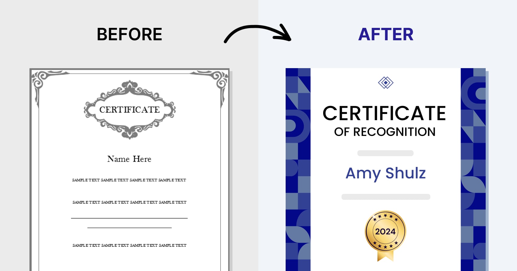
Make sure that your certificate follows key design principles: Scannable layout, deliberate typography, print-and-share-ready design, purposeful color, provable authenticity, and consistent branding.
A cluttered, generic certificate reads as low effort — that's what keeps it off LinkedIn, out of print, and off the wall.
Steps for creating a professional certificate design: Set your goal, pick a template, open it in the builder, add your logo, apply branding, fill in required content (dynamic fields, QR code)
Common certificate design mistakes: Clutter, mismatched tone, no sharing options, and poor print or email delivery — check for these before you send anything out.
Make sure that your certificate follows key design principles: Scannable layout, deliberate typography, print-and-share-ready design, purposeful color, provable authenticity, and consistent branding.

The idea of any digital certificate is to create a memory.
Make the design of a certificate, achievement, or diploma with care. Effective certificate design works and delivers visible results for the business. Among those results, one may find a marketing reach and an increase in the power of a company's or individual brand. Lots of sharing events on social media like LinkedIn or Instagram are also among the effects of a good certificate design.
All parts of the design, from the main elements to the small embellishments, set the tone for how the certificate is perceived by the person receiving it.
Here’s a detailed guide on how to design a professional certificate without a professional designer.
How to design certificates?

01 Set up a goal and clearly define your recipient
02 Create your free Certifier account
03 Visit the library of free ready-made certificate templates
04 Click on the certificate template and start designing your first certificate
05 Add your company’s logo
06 Make your certificate designs consistent with your brand
07 Fill the certificate design with the main content
08 Email your certificate design
"Why are you generating certificates?" – this is the question you need to answer before you create the design. You need to define the goal clearly.
With well-designed certificates, you can accomplish the following goals:

increase the value of the education program, course, or webinar
increase the feeling of the importance of the event
increase marketing outreach on social media
keep a warm memory for the recipient of the certificate
compliment and thank the recipient
You also need an answer to the question: "Who are the recipients of certificates? What is the occasion of granting this award?" Understanding your receivers strongly impacts the style of the certificate design.
Сertifier is great both for small organizations and for large-scale certification programs. It is the best free certificate maker.
To start making designs, sign up for Certifier. It is absolutely free.
With the help of Certifier, you can quickly create certificate designs and send certificates in bulk by email. It’s a ready digital credential infrastructure with all the features that you need. Among them are a visual drag-and-drop certificate builder and a certificate email sender with pre-made templates. Do you want to see more?
Now, you can select one of the free 1,000+ ready-made templates. Decide on these important elements.
colorful or restrained certificate style
portrait or landscape orientation
US letter or A4 paper size (keep size consistency)
filled or minimalist design
formal or informal layout
Your certificate template should meet the preferences of your recipient. This is a fundamental step in your future design customization. Your design decision is what makes this certificate significant and remarkable.
All pre-made templates are 100% editable. This allows you to remove design elements, as well as upload images and graphics to your certification template.
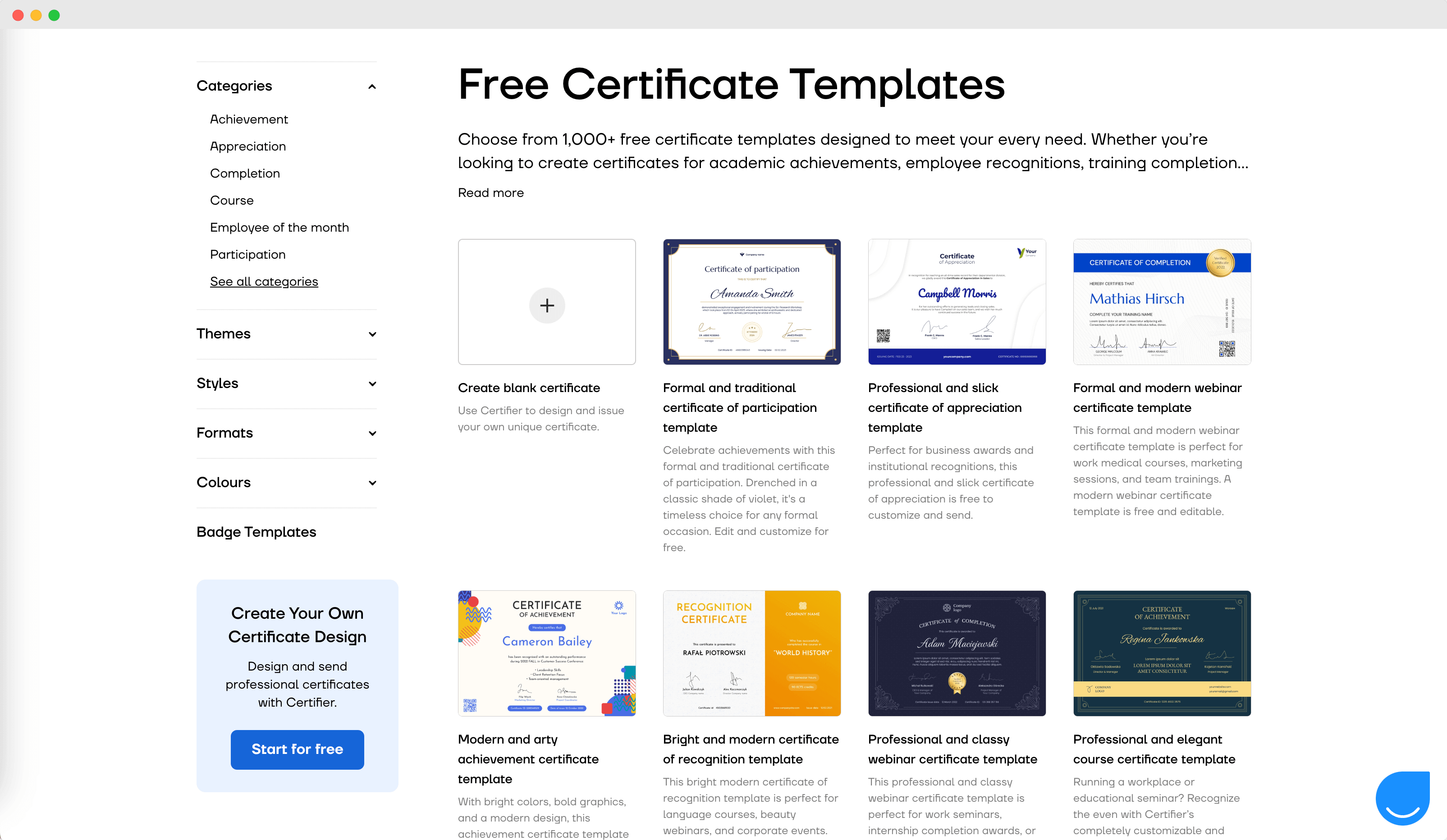
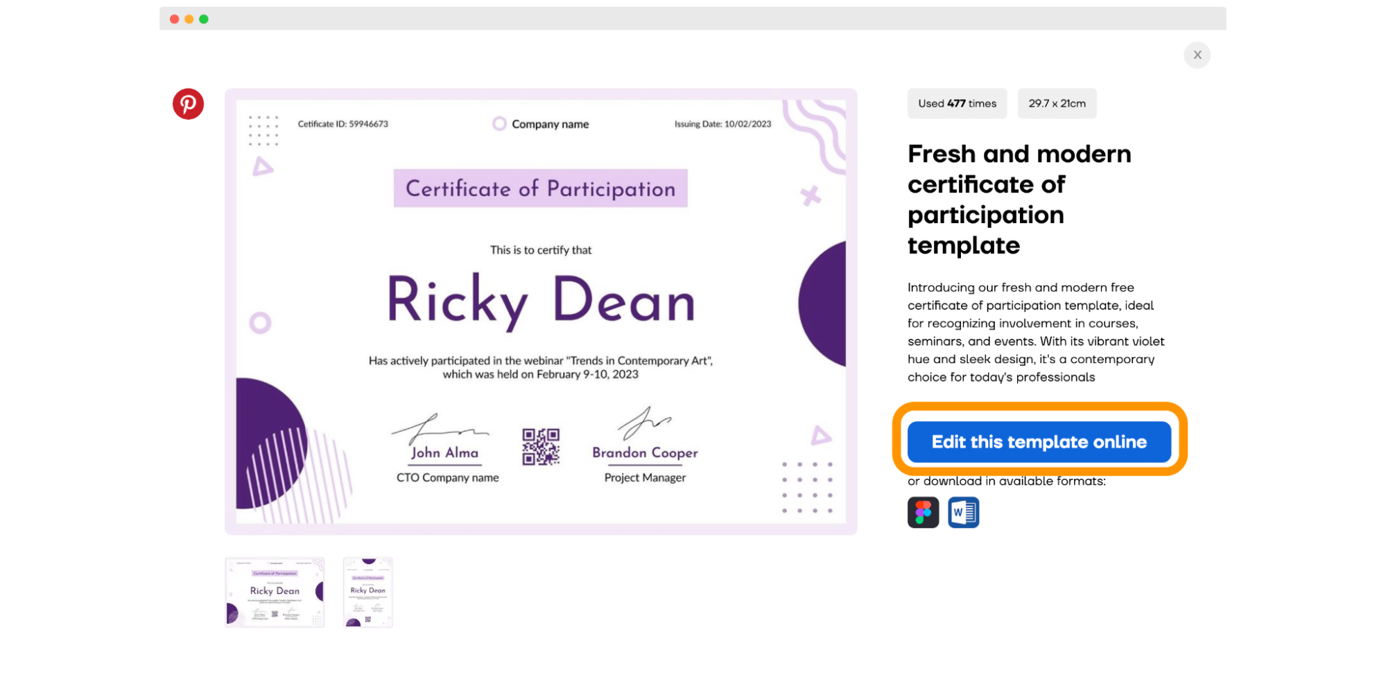
Once you have filtered the library and picked your favorite templates that suit your topic and color theme, you should decide which of them you like best. Having made up your mind, you should click on the certificate and then on the blue button “Edit this template online.” It will automatically lead you to the Certifier design-builder to customize the template further.
Customize your certificate template to match your branding elements perfectly. The first thing you probably want to do is to add your company’s logo. You can do it easily via the Elements tab. Click on the Upload Image button and choose the file with the logo (PNG or JPEG).
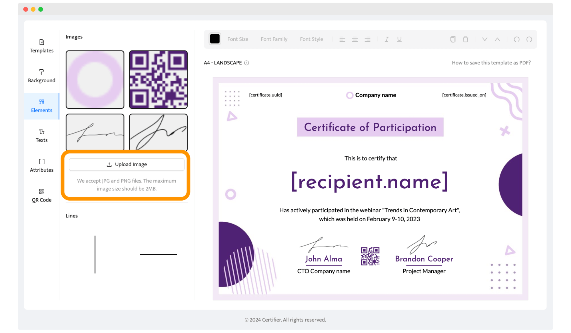
Tip: Use PNG to upload your logo with a transparent background to match your certificate design perfectly.
Now, it’s time to tailor the rest of the certificate design elements.
Change the certificate title: You can easily change the certificate title to match your event or course.
Change color combination and fonts: Your design should look like an integrated part of your marketing and correspond to the visual authenticity of your brand.
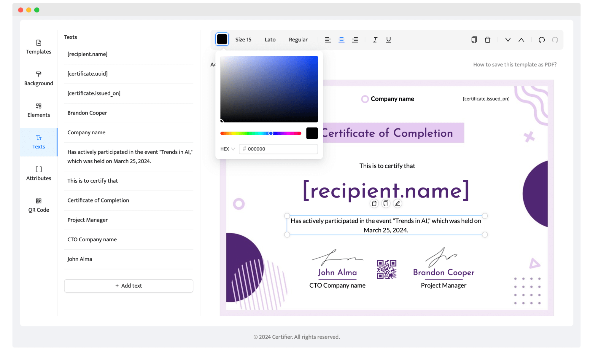
Would you like to design a certificate along with us? Check out the video below, Aksen will walk you through the design process in 4 minutes.
Awards and certificates must include key information. The goal of any certificate is to make it memorable to the recipient for a long time. As a rule, the design should contain a few key elements:
Full name of the certificate recipient
Reason for issuing, e.g., certificate for students graduating, academic achievement, gift certificate, etc.
When and/or where the certificate is issued
Issuing organization or company
Unique ID number of the complete document
These elements can vary from document to document. That’s why Certifier provides dynamic attributes for bulk certificate generation. Dynamic attributes are placeholders for recipients’ data that automatically fill out with the appropriate recipient’s name and data. You can add, remove, and manage dynamic attributes via the Attributes tab. Thanks to them, you can create thousands of certificates in one go.
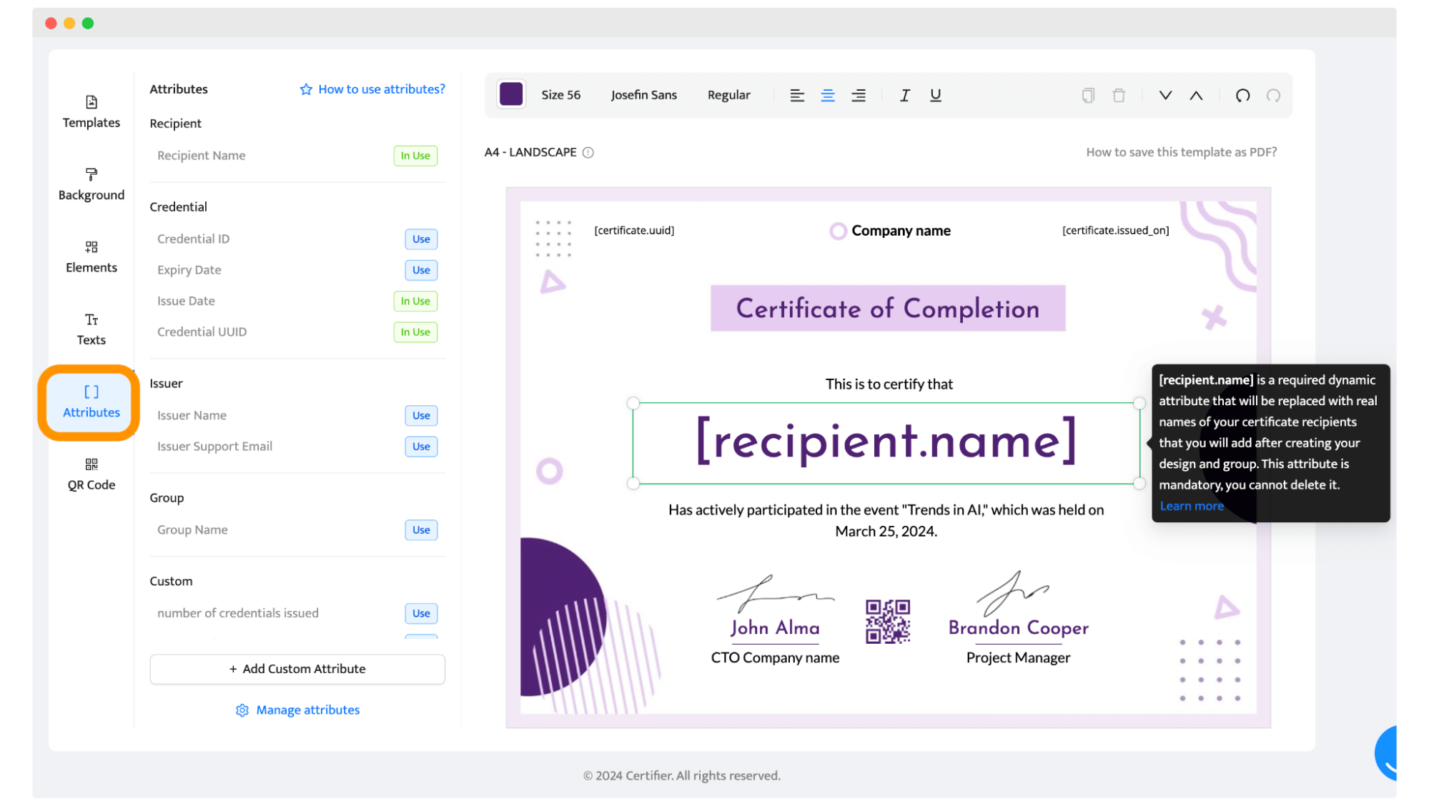
Then, you can add digital signatures – Certifier provides many fonts suitable for signatures, but you can also upload your own signature image via the Elements tab. You can make png signature free with SignWell.
Tip: Create a certificate QR code to make it easier to verify. Go to the QR code tab and click “Add QR code.” You can customize the code color and size. When scanned, the QR code will lead the reader to the digital version of the credential and the recipient’s wallet, from which they can verify the certificate further.
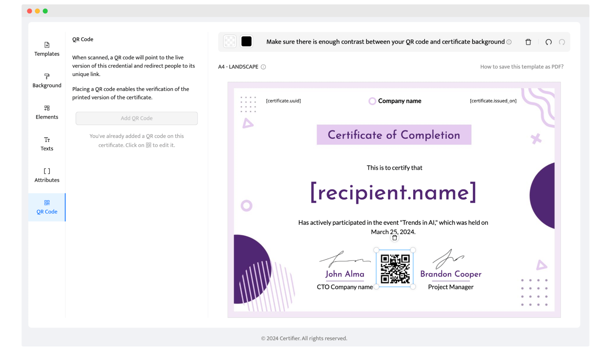
If you’re making the certificate design just for yourself, you can add your name and email address in the Credentials tab. If you want to send certificates in bulk, upload the spreadsheet with the recipients’ data. If you want to learn more about how to send certificates via email, go there: How to send emails with certificates to multiple recipients?
Once your recipients get the certificate to their email, they’ll be able to download it to certificate PDF or share it on their social media.
The difference between a certificate people are proud to share on LinkedIn, print, or frame, and one that gets closed and forgotten often comes down to a handful of design choices.
To create a professional certificate design, follow these key rules:
Every certificate has four key details that should be scannable within seconds:
Recipient name
Achievement
Issuer
Date
When a layout crowds in extra graphics or competing focal points, the reader has to hunt for the details that actually matter, which undermines the certificate's core job: being instantly understandable.
Give the four core certificate details visual priority, and let other elements support them rather than compete with them.
In an informal but widely cited 2012 New York Times experiment, readers rated the same statement as more credible when it was set in Baskerville than in other common fonts. The point isn't that Baskerville is "the best" font. It's that typography clearly shapes how people perceive information, often before they've consciously processed what it says.
On a certificate, that perception effect has a specific job to do:
Match the tone to the occasion. Serif fonts (the kind most universities use) read as formal and ceremonial, which fits degrees and professional certifications. Clean sans-serif fonts read as modern and approachable, which fits course completions and workshop badges.
Build the hierarchy by size and weight in this order: title, recipient name, achievement, supporting details.
Get both right, and the reader understands what the certificate means before they've consciously read a word.
Most certificates live in three formats: a downloaded PDF, a printed page, and a shared image on a phone screen.
A design optimized for print alone often loses legibility when it's scaled down to a LinkedIn thumbnail, and a design built for screens can fall apart at print resolution. Test the layout at the smallest size it's likely to appear, not just the largest, since that's usually where legibility problems first show up.
Color works best as a wayfinding tool: separating the header from the body, drawing the eye to the recipient's name, or reinforcing brand identity through a consistent palette.
The risk is treating color as decoration instead, where every element gets its own hue, and the hierarchy you just built with size and weight collapses.
Keep contrast high between text and background, specifically, since that's the pairing that determines whether the certificate is actually readable once printed or compressed for the web.
Seals, signatures, borders, credential IDs, QR codes, and issuer logos do two jobs at once:
They make the certificate feel official
They give it a way to actually be checked.
The first job matters for how the certificate is perceived at a glance. The second matter is when it needs to hold up, when it's printed, submitted to an employer, or shared in a professional context where someone might want to confirm it's real.
Keep your logo, brand colors, and tone consistent across every certificate you issue. That consistency turns each shared certificate into a small, repeated touchpoint with your brand, one that compounds over hundreds or thousands of recipients in a way a single landing page can't.
Want to keep you safe from mistakes in certificate design? Here is a list of the few most popular mistakes that creators make.

Inattention to detail: Mismatched elements, misaligned lines, and improperly integrated images can mar the certificate's professional appearance. Use design features in the Certifier design tab for a polished look.
Lack of social sharing options: Modern certificates should be easily shareable online. Digital certificate creation tools often include features that allow recipients to showcase their achievements on platforms and add them to their LinkedIn profile.
Improper distribution methods: Sending certificates in bulk via email can lead to them being marked as spam. Tools like Certifier certificate generator optimize the email-sending process, ensuring your certificates reach their intended recipients.
Poor physical delivery quality: If sending printable certificate templates, ensure they are printed on high-quality paper and packaged securely to avoid damage during shipping. The joy of receiving a certificate should not be diminished by poor presentation.
Go through this checklist to find the answer: “How do I make the best certificate?”. Check whether your certificate has all the necessary elements:
Document title – certificate, diploma, confirmation, etc.
The company's logo
Digital signatures
QR code
Full name of a recipient ([recipient.name] attribute)
Course/program/webinar title
Additional information about the achievement
Score/mark
Issue Date
Website (if applicable)
Expiration date (if applicable)
Certificate ID (if applicable)
What does a certificate look like if it contains all the elements mentioned above? Want some inspiration? Look at these beautiful certificate designs (you can download them from the Certifier library of premade templates).
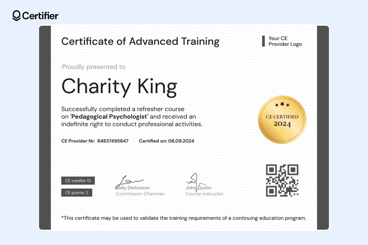
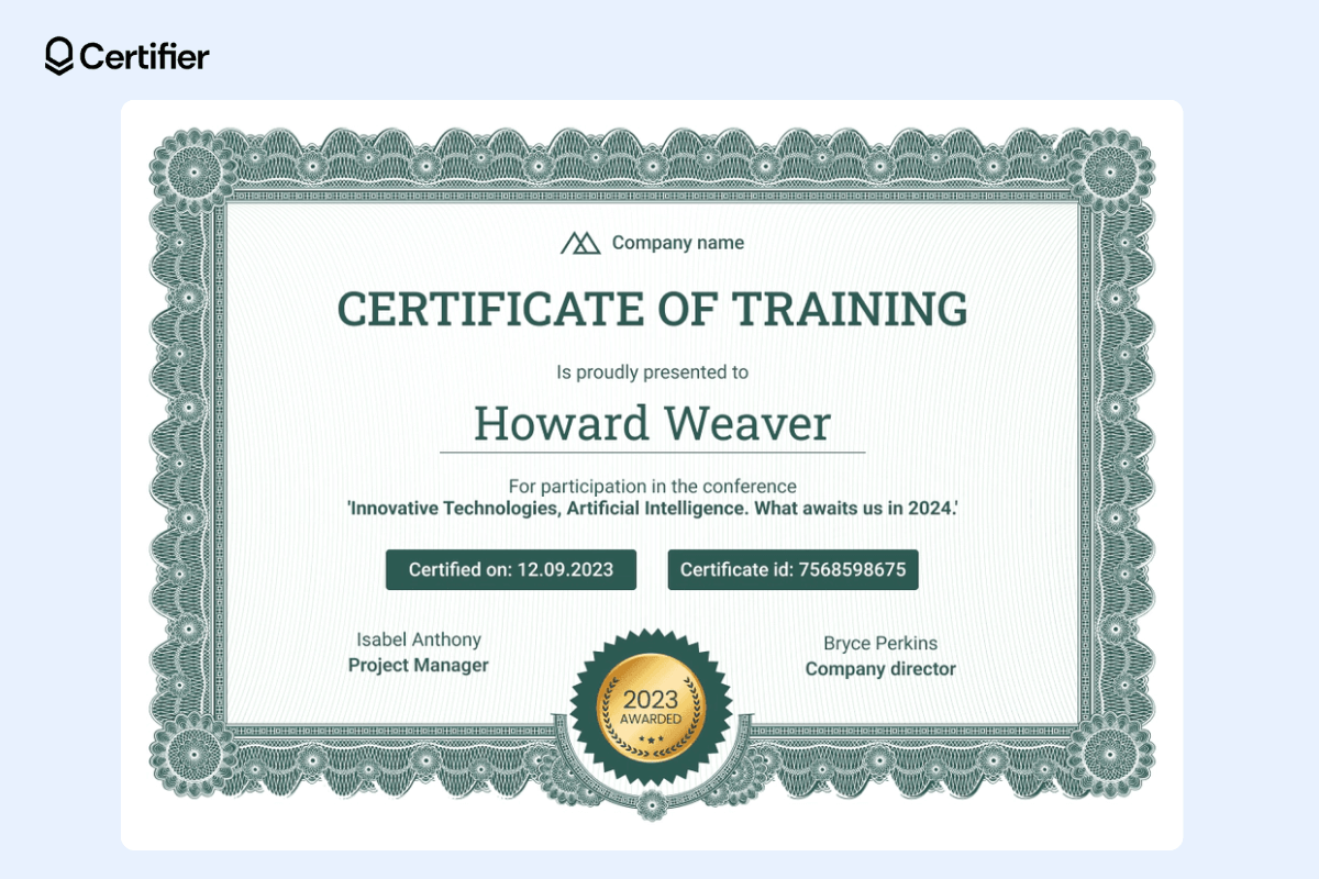
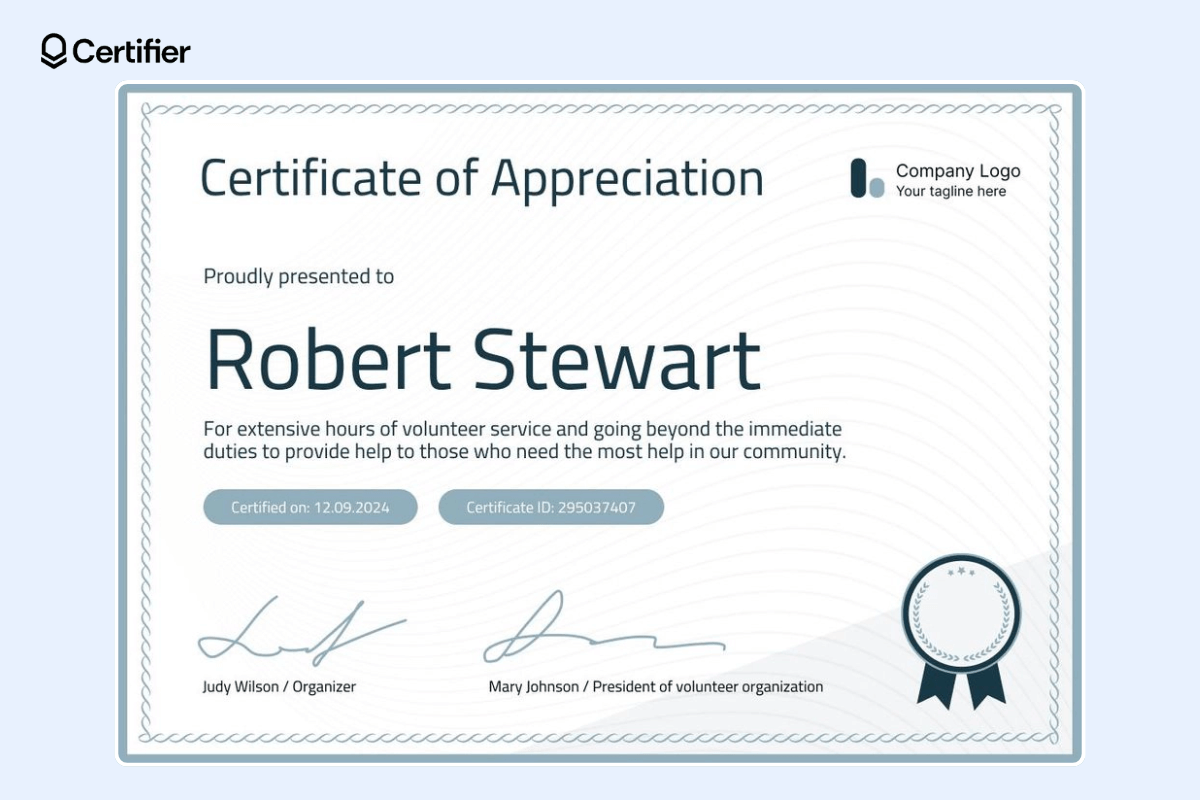
Make certificate design step by step, avoid the most common mistakes, and you will be surprised at the results. It does not matter whether you create a certificate for a few kids in a school or conduct a mass certification program for thousands of people. You should create an effective design that will get results.
Create a free Certifier account, design a certificate, or use a certificate design template in an online certificate maker, add recipient lists, map attributes, and send certificates in minutes.
Here's a list of the most frequently asked questions related to the digital certificate creation process.
Creating certificates is pretty simple with the Certifier certificate templates!
Choose your favorite template from the free library.
Consider the certificate's theme and the recipient's achievements.
Customize the certificate background color to your branding color schemes (you can use the color picker tool and different font styles).
Don’t forget to add visual elements like the company’s logo.
Adjust the design elements to fit your needs, from the certificate border to the title box.
Insert the necessary details such as participant names, the text, and the date.
Review your design for consistency and accuracy.
Then, use the certificate issuing process within the Certifier to generate a digital or printable version of this certificate. Voila!
Well, we’re not too subtle, but Certifier is the best choice you can make! It provides many advanced options within the free plan and ready-made certificate designs that you can customize however you want to. What’s more, it allows you to generate even hundreds of personalized certificate designs in one go. Then, you can send them all out to recipients’ inboxes with a click. Isn't that handy?
A certificate template is a pre-designed document that provides a basic structure for creating various types of certificates (appreciation certificates, achievement certificates, etc.). Templates can range from simple, casual certificates to more elaborate, artistic certificates. Certifier templates come with placeholders (dynamic attributes) for essential details like names, issue date, etc. They are designed to give users the capability to generate certificates in bulk, tailored to each recipient.
1) Choose a digital certificate template that suits your needs.
2) Customize your template using design tools for color schemes, fonts, and graphics. The design process should involve selecting a favorite border design or adjusting the certificate background image (with Certifier you can upload custom background as well!).
3) Input the necessary details, such as the recipient's name and the nature of the achievement.
4) Once the design is finalized, generate them and send them out to the recipients.
Ensure the digital certificate creation process includes options for secure sharing and verification, like embedding a QR code or digital signatures.
Yes, it is! Certifier offers a forever-free plan for up to 250 credentials per year. The free plan lets you use all the certificate templates, customize the layout, add you own branding elements – there are no differences between the free and the paid plan here. Within the free plan, you can also generate certificates in bulk and send them out to the recipients’ emails. Worth trying out if you want to streamline your certification process.
A professional certificate design comes down to six choices:
A scannable layout that puts the recipient's name, achievement, issuer, and date front and center;
Typography that builds a clear reading order through size and weight;
A design that holds up whether it's printed, downloaded, or shared on a screen;
Color used to guide the eye rather than decorate;
Elements like seals, signatures, or QR codes that make the credential provable;
Consistent use of your logo and brand style so every certificate reinforces your brand, not just a generic template.
A good layout makes it easy to find four details within seconds:
The recipient's name
The achievement
The issuer
And the date.
Those four pieces of information need a clear visual priority over everything else on the page.

- B2B SaaS marketing
- Digital Credentials
- Content Strategy
- On-page SEO
- Lead Generation
Chief Marketing Officer
Aksen leads marketing at Certifier, bringing 7+ years of experience with global brands to position digital credentialing as a trusted solution for training providers and educational institutions.


